Perfect choice of game to display this
…how? HOW?
Missed opportunity to include Portal 3
Fucking Steam always getting shittier with each update! Why can’t they be better like Microsoft’s XBox Store or DRM free like Epic Games?!
Comment from the alternate timeline
Crazy how Microsoft sold of their XBox brand to Sega, conserding that this single handetly made Sega the biggest video gaming company world wide!
can someone make this a thing somehow?
Didn’t Steam have skins/themes back in the day?
They’re still out there technically, but they get jankier every year. The new UI they released… last year? put the nail in the coffin for a lot of the fancy ones, but there are still options out there to skin your Steam UI.
Frutiger Aero
I don’t know how to feel about this.
It’s making my micro soft
Were you actually an awesome gamer though?
 A better timeline?
Windows UI design peaked with Windows 98 and Unix UI design peaked with IRIX imo
Back when they had consistent style guidelines to follow (I remember reading them, along with deep descriptions of how PnP actually works - yuck!).
Now they just throw shit at the wall it seems
Nightmare fuel
Needs to be running on Linux to make it perfect.
Well atleast for Gnome we have AdwSteamGTK which make Steam fit seemingly into LibAdwaita.
I don’t think that those three buttons would be in the statusbar. “Add a Game” would be in the sidepane “Games”, “Manage Downloads” and “Friends and Chat” would be a view (in the sidepane) instead of a button.
but overall, a damn beautiful interface :)
Frutiger Aero from Windows Vista and 7 was the peak of UI design.
It was so much more welcoming and fun. Sure it sucks at scalability but that’s easily resolved with proper vector graphics.
Thanks, I hate it.
Can we return to Aero? Is that too much to ask?
Skip aero. Let’s go back to compiz fusion and deskcubes.
New KDE brought the cube back!
Have a look at Wayfire. It’s a Wayland compositor that implements a lot of the compiz effects/plugins. I recently found that but haven’t tried it myself as I don’t really care about wobbly windows and cubes as much as I did 15+ years ago when I first tried compiz as a teenager :D
I’m rocking a desktop octagon with two monitors with all the fancy window animations on and still using less ram that windows on idle lol.
I’ve been long enough on this place that I know you can get similar effects on Linux
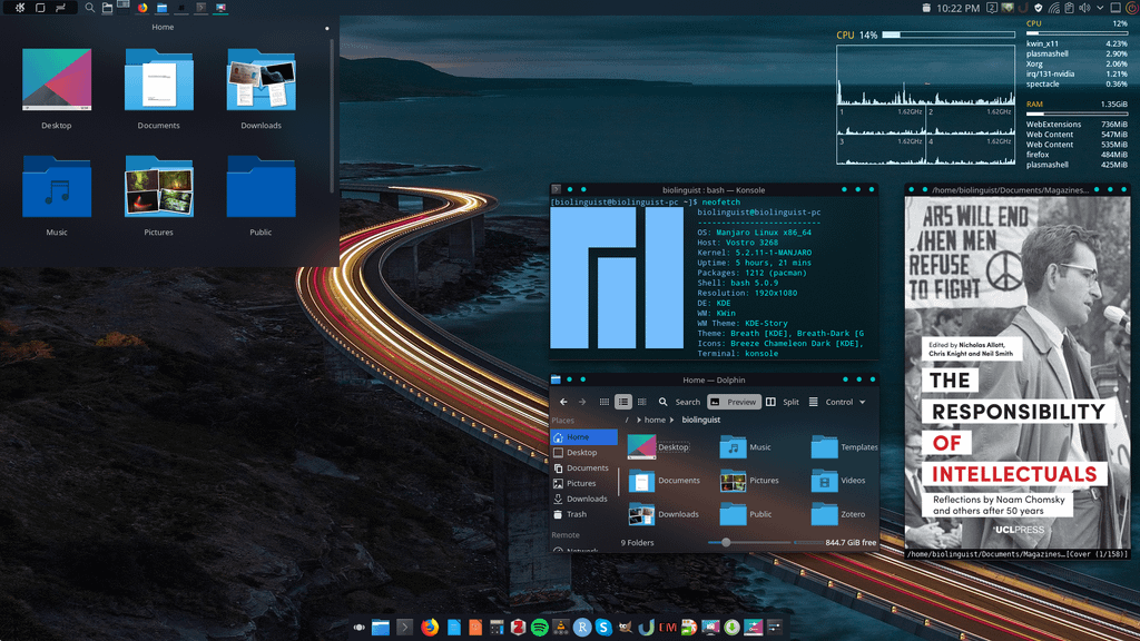
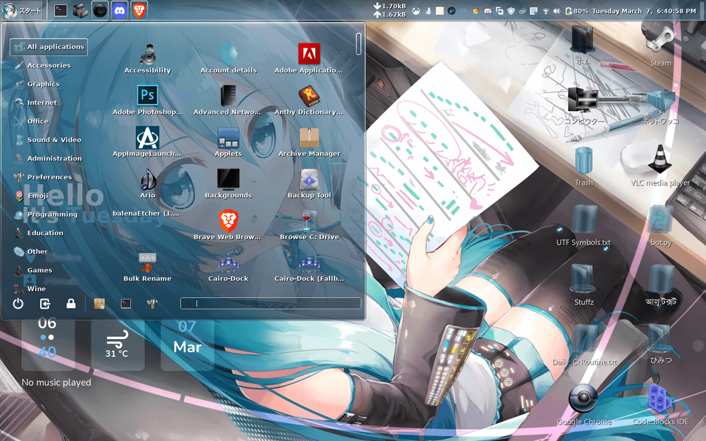
(not mine, found on image search)
Second picture theme is called: Clearglass. Icon: Glass icons by Palko drawing.
…For anyone interested

It’s pretty easy! This is my desktop right now. I do like it a liiitle less gaudy and my mac use at work means that I prefer my window controls on the left instead of the right.
first screenshot doesn’t look like aero at all tbh. second one more so. this is the most accurate port I know of tho https://gitgud.io/wackyideas/aerothemeplasma
This is the kind of thing I had in mind!
Aero is more than just the blur effect, modern OS’s still have that in spades.
i want to install plasma just for this now
I hate this. I’m pretty sure this gave me PTSD somehow.
