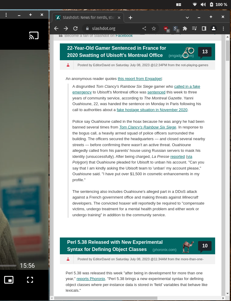
You can’t even just uBlock zap the sidebar since the feed div has a fixed right margin. StyleBot to the rescue.

Much better!
Also mildly infuriating is if you try to grudgingly load the mobile site in a desktop browser, it just redirects you back to the crappy, non-responsive desktop version.
If you found this useful, here’s the CSS overrides to use:
#slashboxes {
  display: none;
}

.main-content {
  margin-right: unset;
}


It was after installing and using Pop OS that I truly realized the importance of responsiveness.
Not familiar with PopOS, what are you referring to?
Pop OS is an Ubuntu derivative developed by System76 (who make a range of Linux laptops). It uses a customized GNOME that has a window tiling plugin (among other things).
I’ve only run it for a week, and I like it. I was hesitant since it’s Ubuntu-derived and doesn’t fully protect you from The Snappening, but I’ve worked around that and am really enjoying it.
Gotcha, so ur just referring to the responsiveness being necessary when squeezing in windows of varying sizes with the window tiling.
Def agree, though I experience it with Windows and their PowerToys tiling tool
Indeed. You can instantly pick out bad websites, and I’ve started using stylebot more and more to fix them. lol