[It could be sooo easy to solve, but noooo…

Without the distracting colors, now I can see this says MAPOD
i see the new icons wanna intergrate googles colors ngl
What I keep seeing: $ $ $ $ $
Also I’m sure the designs are absolutely as humanly possible adapted to perfectly achieve their goal. Too much money, people, and time involved for this not to be the case.
And the goal was never ease of use, that doesn’t bring in any more money when you have a monopoly. Engagement & forced ads do.
(By ‘forced ads’ in this case I do not mean directly advertising a specific product, but forcing you to pause your thoughts to specifically and consciously think about Google making the name/brand ever more part of your actual life and as such its shitty behaviour gets normalised, even trusted - thats just how our brains work even when we think otherwise … and I hope we all think of Google as a curse on humanity.)I just stopped using most of them
I stopped a time ago. Interestingly, the thing I miss most is maps. That sheer amount of user data paves the path for a fine traffic estimation.
Maps is indeed the odd one out. I’m trying to switch to magic earth, but it’s not as good yet.
What’s the font used in the heading? Is it some flavour of Helvetica?
It does not seem to have consistent kerning.
Probably Roboto.
Grotesk maybe. The curve of “h” doesn’t seem to go high enough. Otherwise pretty close.
Man… I might be showing my age, but checking out some of the links in these replies gave me nostalgia for the website FontsnThings.com (or was it “FontsandThings”?). I used to love browsing that shit as a kid and downloading all the coolest looking fonts lol
Anyone else?
My wife really really really wanted a MacBook in 2020 and the major plus of having it is that I got to steal all the fonts. Mostly, I just wanted Helvetica lol
It certainly looks a lot like Helvetica. Probably could be any of these Helvetica clones:

I will also say that it feels a lot like Inter to me, which it’s not as the i-dots aren’t round, but maybe you’ll enjoy that one anyways…
Since Gmail doesn’t have the obvoious envelope anymore I often open it when I want to open Maps. My brain ist like “M for Maps”.
Plus the art they started using in gdrive. The art on its own is cool but within the Google ecosystem just feels like… what is it even… why… ugh I hate it.

prevent body shaming by only showing obese/disfigured people so society accepts it as a healthy norm
Corporate memphis does incorporate a sort of identity vagueness.
Almost all human features, body, skincolor are in a uncanny valley. Non-personal enough to be general yet similar enough to be relatable to pretty much any theoretical demographic.
In reality it falls flat. Many people (non partisan) dislike it because of how artificial and shallow it feels.
What it is definitely not is a deep plot to change the social perception of checks note people with non idealistic body features.
Google has no economic incentive to improve your opinion of disabled people who are equally part of this group you appear to find non acceptable to exist in the workforce.
Google has no economic insensitive
“Economic incentive”, right?
My english is self taught, i’ll take your word for it! (Pun intended)
Ah in that case insensitive (in+sensitive) is a synonym to rude. Incentive is closer to reward.
Slow down there, Dr. Gall…
I am actually quite fond of this style, though this might be controversial
Corporate Memphis. It’s an art style a lot of people hate, and I can understand why.
I’ve recognized this style as a generic corpo art, but never had a name to put to it. Thanks for that.
Sanitized, pandering, and insincere, Wikipedia describes it perfectly.
soulless corps trying to seem friendly, that’s why
Yeah like in 50 years I can absolutely imagine people loving it as a style of a time. I recognize I like pop art far more than I would if I was in its target demographic. But also I don’t hate it, it’s just so everywhere and so soulless. It’s the style of “money please” in a time of great socioeconomic inequality. It’s art deco but demanding friendship and comfort rather than respect and awe. But more than anything it’s art for business people, and I just don’t care for business people.
Corporate Memphis
Link for the lazy: https://en.wikipedia.org/wiki/Corporate_Memphis
I actually think these are fine. If I can quickly recognise each on my homescreen (I don’t use labels) then it’s fine, and I’ve never had a problem with any of these.
I like it because each company each has its own set of apps, and they have somewhat unified app icons.
Proton is the same, which similar icons as google but with their own unified branding.
I like it, personally.
deleted by creator
I think the maps actually looks more distinctive because of the shape. The rest are worse to differentiate though.
In case you want to feel old, this change happened almost 10 years ago now fellow grandpas.
Bro what
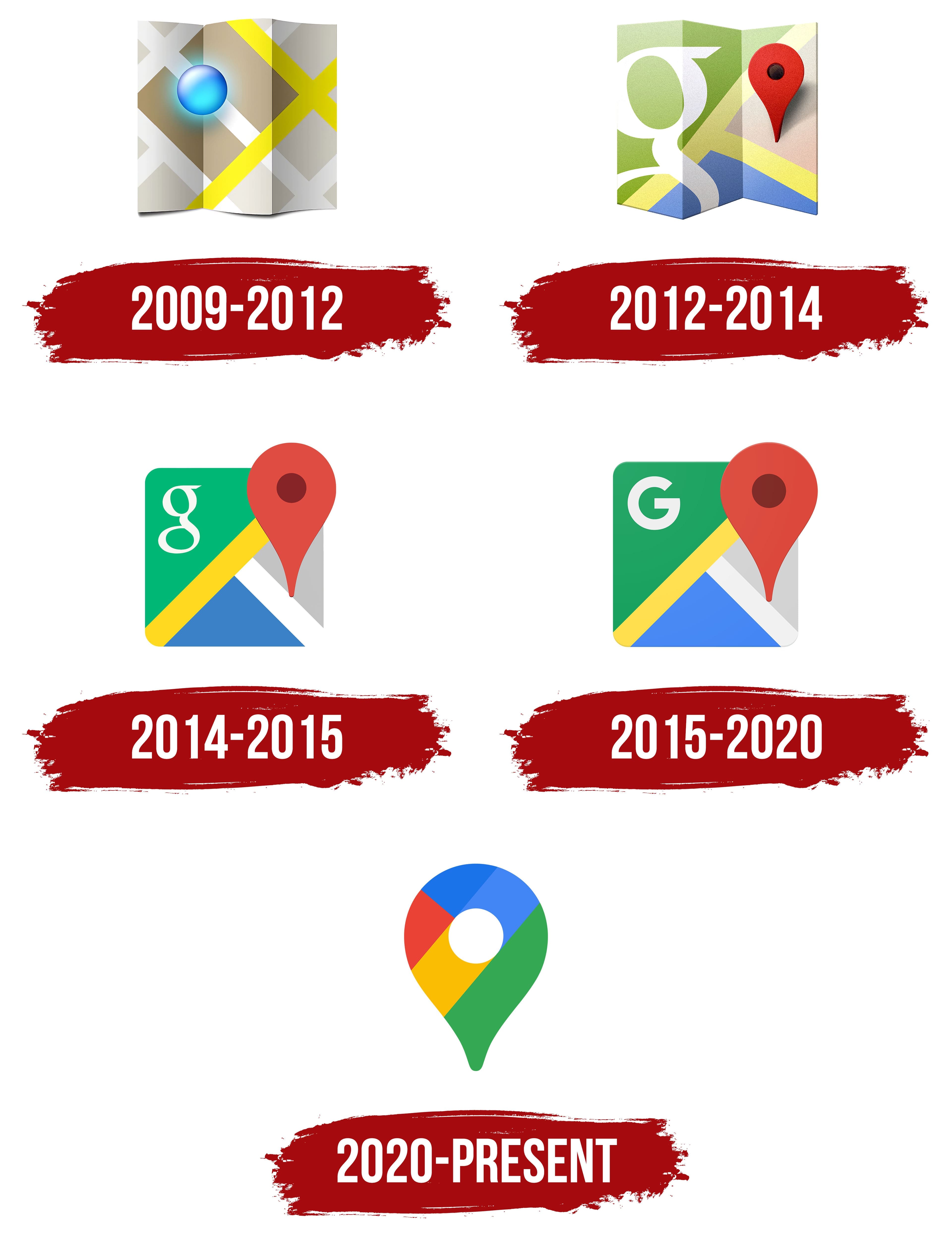
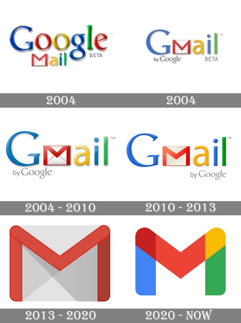
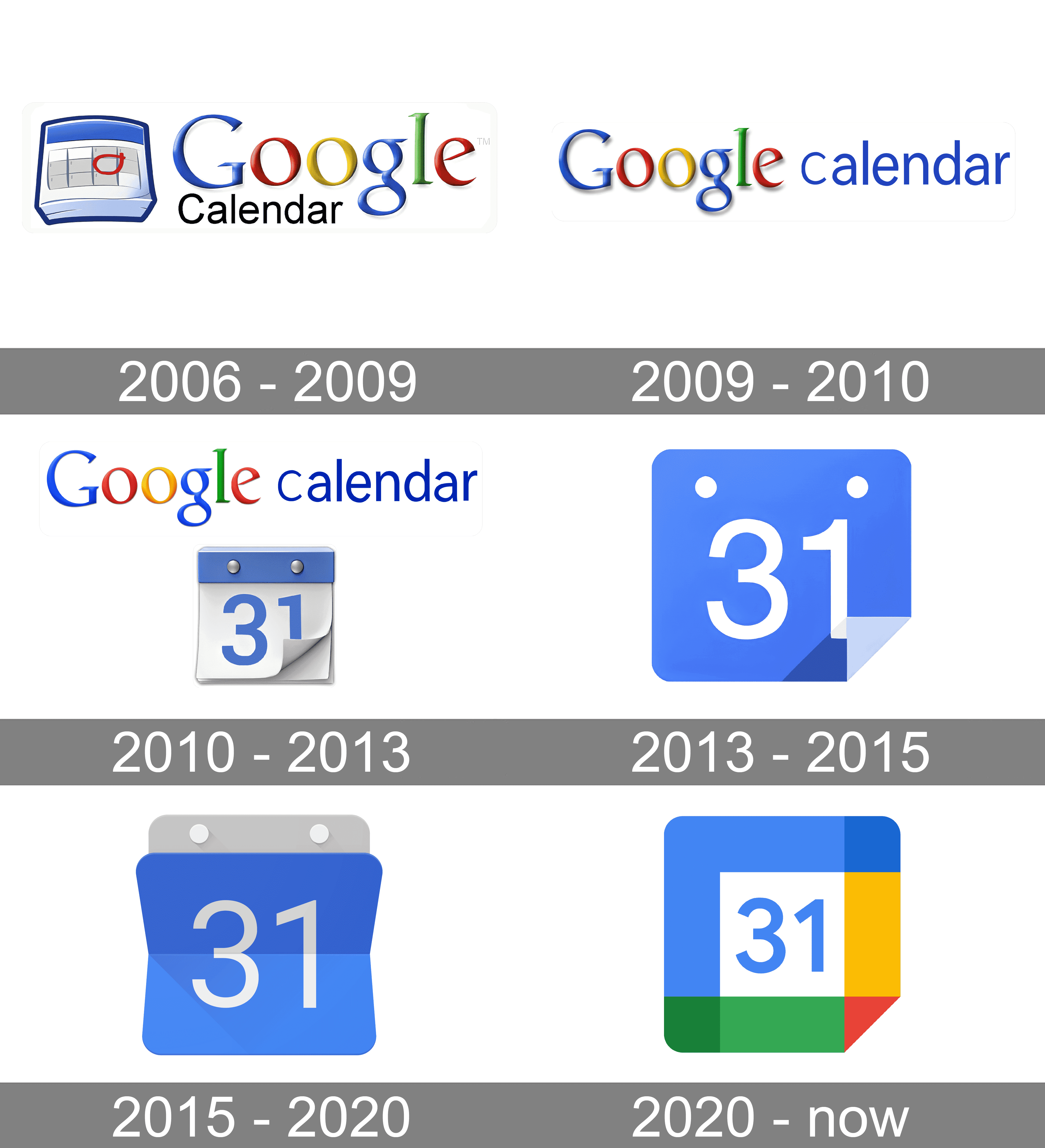
Damn, my 30s flew by if 2020 was 10 years ago
Ok so for me it’s the 2012 maps logo, the 2013 gmail and the 2015 calendar logo.
I confused it with their other branding changes from 2015, who cares I don’t use google anymore lol
Its one of those things u never think about as a person without disabilities, cuz i can tell the difference just fine, i guess they should have consulted someone with a vision impairment when considering stuff like this.
To be honest the maps and the meets icons look better
I wouldn’t even call this “aesthetics”. Rather “conceptual homogeneity” or something like that. It’s what happens when you strive for a uniform look over a useful or visually pleasing one.
In some countries uniform look at least provided good for society. In this case it provides only profits for to 1%.
Good for society:

Even uniformity can be aesthetically pleasing, but these icons are decidedly not.
Anyone else this there’s actually nothing at all wrong with the “New” row of icons? Except for the triangle one, which is terrible in its “Original” version as well, as it indicates absolutely nothing about its app (I believe it’s Google Drive, right?). All the rest are clearly distinguishable, and have relevance to what the app does.
I’m mad that the Gmail icon is no longer an envelope, but other than that they’re fine.
The Google drive logo is even worse when you compare it to the play store logo which is also a triangle. I mix them up all the time

