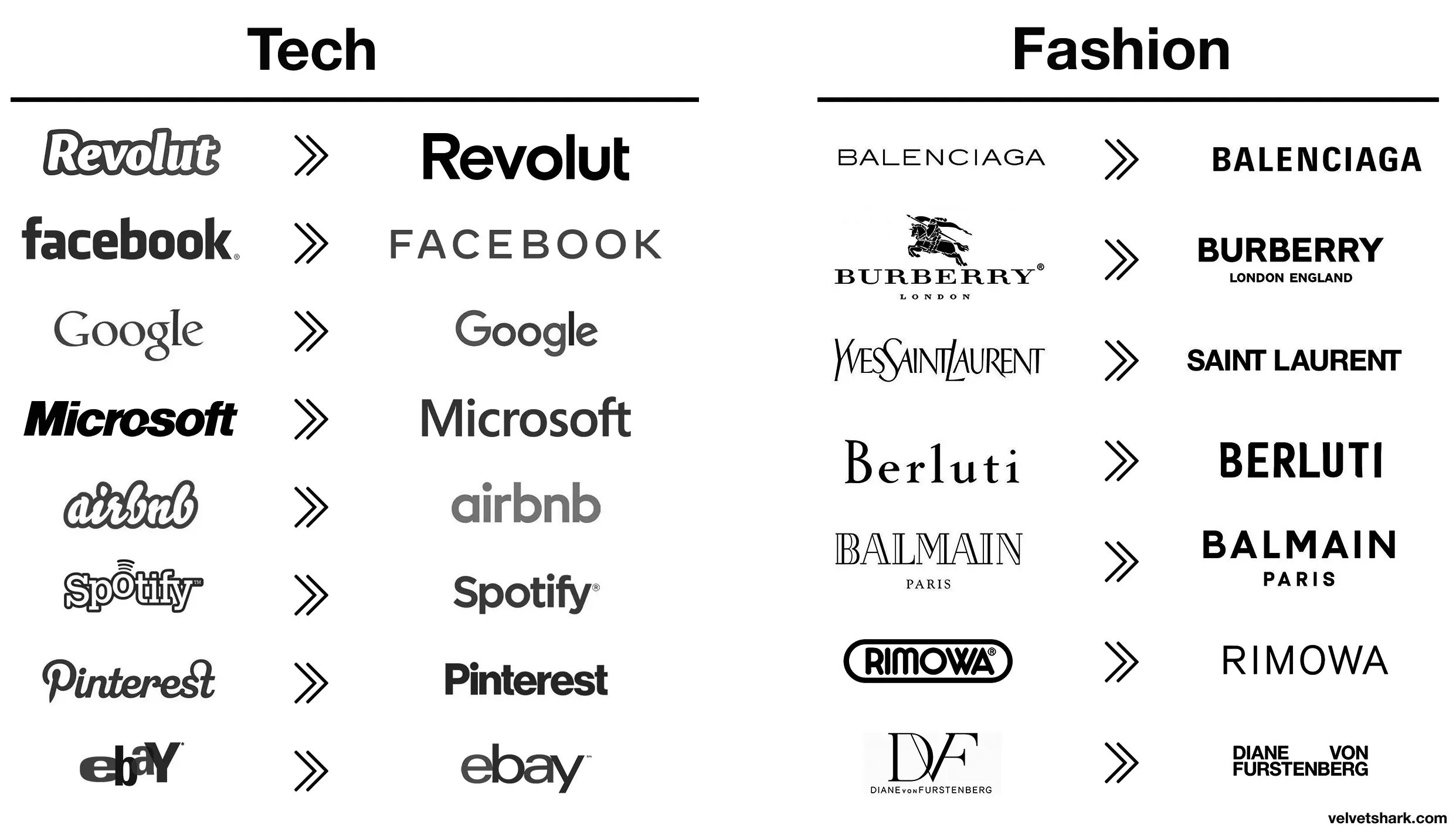
All these minimalist labels save .0005¢ every time they’re printed, probably even more on promo booths, banners, and the like.
Aaaah then indeed that makes sense (and this is not ironic).
Oh, I wasn’t being entirely serious, though there is an element of truth to it. It probably is a measurable cost savings over the scale of the business.
I still think these unremarkable corporate logos are boring AF. Just makes them visually soulless along with just being corporate soulless.
Those old fashion logos are actually sick. Concerning that an industry that sells style would make these their logos.
Except eBay, that was always trash.
Their business is literally selling people’s trash so it’s amusingly appropriate lmao
I would have failed every design class I took in college if I submitted that. Why such wide kerning? Why lower case but upper G? Why so round? Why so completely unreadable at a distance because of micro serifs? There isn’t one good design element in this.


